Colors of Your Blender: Mastering RGB Color Blending with Blend Modes
With regard to graphic design, knowing how to effectively mix colors can change a normal project into an excellent one. Artists and designers are able to produce depth, feeling, and spatial intrigue by blending shades. This article will explain the method of two-color blending using RGB color values as well as highlight how this process can be enhanced by blend modes. It will cover different types of blends, their practical use, and tips on how to improve your design skills.
Understanding RGB Color Blending
Before we go into details about blend modes, it is important that we get what RGB (Red, Green, Blue) color blending is all about. The concept of the RGB color model is fundamental in digital designs which involve the mixing of various amounts of red, green, and blue lights producing a variety of colors.
What’s Color Blending?
It is when two or more colors are mixed together, resulting in another hue entirely called color blending. You can make blends by overlaying colors as well as using certain kinds of blend modes through such software like Adobe Photoshop or web-based applications, for example, those integrated within online image editors).
“Color blending is an art form that adds richness and depth to any design.” – Design Expert
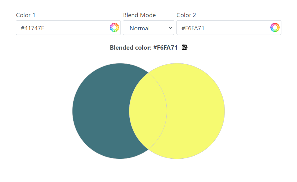
Exploring Blend Modes
Blend modes are a strong feature of graphic design software and determine how colors affect each other. You can create different visual effects that can greatly enhance your work by trying out these modes. Let us break down the usual blend modes you may come across.
1. Normal
Normal is the default blend mode. In this mode, the top layer covers completely without blending with the bottom one. This is good when you want to keep the original colors intact without any disturbance.
2. Multiply
This Multiply mode is often used when you want to create shadows or darker tones. Here, colors within darkened through multiplying base color with blend color(s). The resultant hue goes deeper, hence ideal for adding depth and dimensionality.
Example: To make a shadow behind an object, just apply a black-colored layer with Multiply.
3. Screen
Conversely, Screen blend mode does the opposite of Multiply as it lightens colors by inverting colors and then multiplying them, producing a brightened version of a base color.
4. Overlay
Overlay can be used to mimic the effects of screen and multiply. Shadows on the darker areas of the base layer will increase while lighter regions will become more intense. This is useful for adding textures or making images brighter without using more layers.
5. Soft Light and Hard Light
Both Soft light and Hard light blend modes allow blending of the base and fill colors respectively, creating either subtle or sharp changes in effects.
- Soft light mimics diffused lighting which is good for delicate adjustments.
- Hard light makes an image more dramatic by providing greater contrast between its parts.
Practical Applications of Color Blending
Now that we are familiar with the basic blend modes, let us review some of their practical applications.
Creating Depth in Illustrations
Depth is essential when working on illustrations. For instance, you can use Multiply to create shadows below characters or objects. Also, try different shades in order to get a more credible picture. To bring out specific details, add highlights with Screen mode as well.
Designing Web Elements
Color blending can be a major boost for buttons, backgrounds, and typographies in web design.
A possible way to keep the elements popping while retaining a uniform color palette is by using the Overlay mode.
Play around with gradients: blend two contrasting colors and put a gradient overlay which you can make catchy backgrounds.
Understanding how colors combine will definitely take your creative expression to the next level, whether you are designing for print, web, or digital media.
That said, keep in mind that your color palette has endless potentials whenever you sit to make art again. Play around and unleash your imaginative senses!
Call to Action
What blend modes can you discover by delving into your favorite design software today? Which different from what we already know color blending effects can be produced?
For more information on color theory, see Adobe’s Color Theory for a comprehensive study on incorporating color into design projects!